Swatch Hunting at the Ironmonger’s: A Frugal Colour Crawl
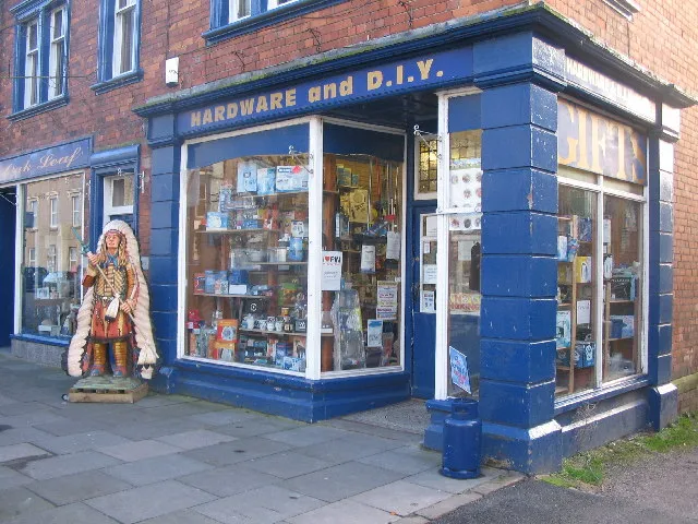
Photo: Phil Williams, CC BY-SA 2.0, via Wikimedia Commons
I went into the local hardware shop for picture hooks and came out with a colour palette. It was a grey Saturday in November, the sort that makes every shop window look like a painting. Inside, the fluorescent lights buzzed over pegboard and tins. I found the hooks, then got distracted by the paint-mixing desk. Ten minutes later I was photographing dust sheets and twine like a tourist. This is a studio diary about looking properly in an unlikely place.
Start at the paint-mixing desk
Paint sample cards are free, which makes them dangerously tempting. I take two or three, not the whole rack. The point is not to copy a branded palette. It is to notice relationships. Mushy pea green next to dusty pink. Industrial grey next to mustard. A chalky off-white that makes everything beside it look warmer. I photograph the cards in flat daylight near the door, then write a note on my phone: contrast, temperature, why it caught my eye. If the shop is quiet, I ask whether it is alright to take a handful. It always is, but asking matters.
Read the shelf, not the label
Hardware shops group things by function, not by colour, which means the colours collide honestly. That is the useful bit. A stack of dust sheets gives you cream and pale grey. Baler twine gives you orange. Galvanised buckets give you cool metal. Copper pipe gives you warmth. Red warning tape gives you a jolt. I sketch a grid of five rectangles and name the palette after the aisle: 'Aisle 3, 4pm'. It is not poetic, but it is memorable, and it stops me pretending the colours came from a mood board rather than a shelf.
Pegboard is a grid and a mood board
Pegboard holes make a rhythm. Shadows add depth. I photograph it straight on, then close up, then step back to include the shelves. The off-white of old pegboard is a useful neutral for photographing prints at home. It is not archival, but as a background for a quick phone shot it works. The grid also suggests layout: repeated square thumbnails, consistent gaps, a bit of breathing room. Just do not photograph staff or customers without permission. I keep my phone low and my visits short.
Collecting rules
- Ask first if you are taking samples.
- Take only what you will actually use.
- Photograph rather than pocket.
- Note the light: fluorescent versus daylight changes everything.
- Keep a small envelope for chips and label it with date, shop and aisle.
- Do not reproduce logos in your portfolio. Crop them out or blur them.
Translate it to portfolio backgrounds
Hardware colours make good neutral grounds: warm grey, chalky cream, dull green, faded blue. Test prints against them. A print that looked flat on white may sing on greige. For web backgrounds, sample colours from your photos but desaturate slightly; screens push saturation. For print accents, choose one hardware hue and use it sparingly: twine orange for a section divider, warning red for a caption rule. For mood boards, pin the chip, a scrap of twine, and one photograph. Do not over-curate. Let the combinations stay a bit awkward.
Cheap colour tricks
A paint chip fan makes a good bookmark. A clean dust sheet makes a backdrop for tabletop shots if you iron it first. Twine works as a prop and as a line in a flat lay. Tins stacked and cropped become colour blocks. The paper bag from the shop has a texture worth scanning. None of this costs much. The hooks were £2.40. The looking was free.
A small caution
Hardware materials are not all safe for archival work. Keep dust sheets away from direct contact with prints, and check acidity if you are using shop paper near artwork. For digital work, a photograph is just reference, so the risk is lower. Also, do not let the palette become a gimmick. The work leads. Colour supports.
The crawl route
I do a loop: paint desk, decorating aisle, gardening twine, cleaning products, checkout. Ten minutes. Five photos maximum, one sketch. Back at the studio, I make one palette card: five chips, the date, the shop, a note. I try to use it within a week, even if only as a background test for a social post. If it goes unused, I bin it. The point is looking, not hoarding.
The ironmonger's is not a design studio, but it is a colour library with a queue. I paid for the hooks, said thanks, and left with a palette called 'Aisle 3, 4pm'. It is now the background for a set of small prints. Not bad for a grey Saturday.