Wet Sleeves and Bright Paper: Three Inspirations from a November Art Book Fair
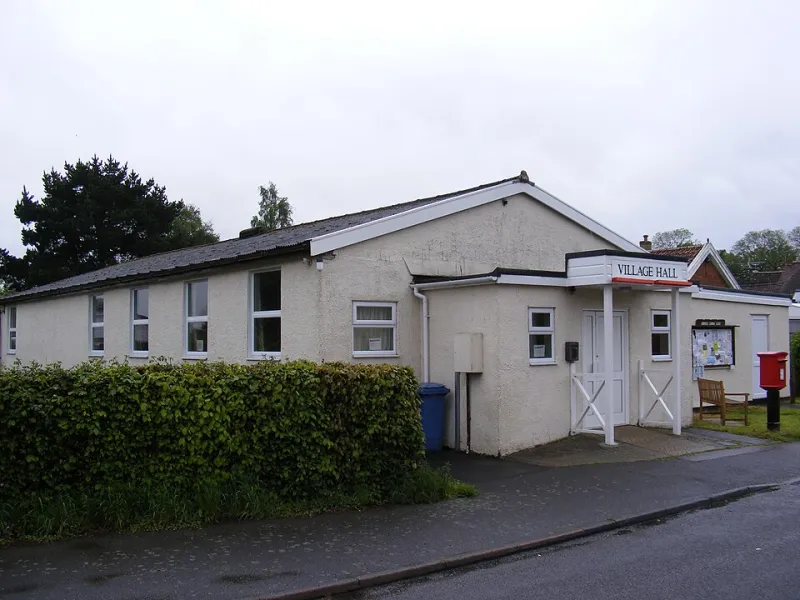
The train was late. The pavement was a river. By the time I reached the hall, my sleeves were wet, my tote bag was damp, and I was already glad I’d come. This November I spent a Saturday at a UK art book fair — the kind held in a community hall with a tea urn, a queue for the loo and a room full of people who make things on purpose. I went with a notebook and no agenda. I came home with three inspirations and a very soggy receipt.
10:40 — The zine table is a conversation
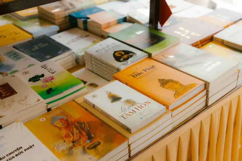
The first thing that struck me wasn’t a single publication. It was the table itself. Zine makers don’t arrange work like a shop window; they arrange it like a conversation. There’s a pile of the new thing at the front, a few older issues leaning against a box, a handwritten sign explaining the price, and usually the maker half-hidden behind it, ready to say hello.
One table had a tiny map of the issue’s route through the city, drawn in biro and taped to the wall. Another had a bowl of stickers and a note that said “take one, or don’t”. It was modest, human and completely unpretentious. Nothing matched, but everything belonged.
That’s the first thing I want to borrow for portfolio presentation. Not the hand-drawn signs or the cardboard boxes, but the logic of the table: lead with the new work, keep the older work visible but quiet, and make the whole thing easy to enter. A portfolio homepage can do that. One clear project at the top, a small shelf of recent things, a short line about who you are, and a way to get in touch that doesn’t feel like a captcha.
12:15 — Risograph colours that refuse to be corporate
The second inspiration was colour. Specifically, the way small-press printers use risograph inks. You see the same limited palette over and over — fluorescent pink, teal, a warm black, maybe a mustard — and yet the results feel wildly different. The constraints do the work. A two-colour print can be loud, tender, nostalgic or strange, depending on the paper and the overprint.
I stood at one table for far too long, holding a booklet that used fluoro pink and a dusty blue. Up close, the registration was slightly off. From a step back, it looked like the colours were vibrating. The maker told me they’d chosen the paper first, then the inks, because the paper was “the only thing that doesn’t lie”. I wrote that down.
The lesson for a 2026 portfolio isn’t “make everything pink and blue”. It’s that a tight palette can be warmer and more memorable than a full spectrum. If your site currently uses six accent colours because you couldn’t choose, try two. Let one be the loud one and one be the quiet one. Use them consistently enough that people start to recognise your work before they read the caption. Restraint, it turns out, can be a form of hospitality.
14:30 — The maker explains it better than the caption
The third inspiration was the talking. At a fair, you hear the work explained in real time. A maker picks up a book, flips to a page and says, “This one came out of a walk I took when I was supposed to be doing something else.” Suddenly the publication has a temperature. The caption on the table might have said “24 pages, two-colour riso”, but the story was in the voice.
That’s the bit I think portfolios often miss. We write captions as if we’re filling in a form: client, date, deliverables, role. Useful, yes. But not very warm. At the fair, the best makers gave me a sentence I could carry away. Not a sales pitch — just a small, specific truth about the making.
So I’ve started recording voice notes after projects, before the details fade. Not for publication, just for memory. What was the turning point? What did I learn? What would I tell someone at a table if they picked up the work and asked? Those notes become captions, or short process paragraphs, or the line at the top of a case study. They make the portfolio sound like a person rather than a PDF.
What I’m taking back to the studio
The temptation, after a fair like this, is to copy the aesthetic wholesale: the riso textures, the brown paper, the handwritten labels, the whole “small press” look. I’d resist that. The energy is useful; the costume isn’t. A UK audience can tell when a studio has borrowed the surface of independent publishing without the substance.
What I want to carry over is more practical. A table-like homepage that’s easy to browse. A tighter colour palette. Captions that sound like someone talking. A bit less polish in the places where polish hides the thinking. And a reminder that scale isn’t everything: a small, well-made thing with a clear voice can hold a room’s attention just as well as a big shiny one.
The takeaway for a warmer portfolio
By the time I got the train home, the rain had stopped and my notebook was mostly smudged. I didn’t come away with a new brand identity or a grand theory. I came away with three small prompts: arrange your work like a table, choose two colours and mean it, and write the caption you’d say out loud.
That feels like a good November haul. Not a museum piece, just a warmer way of showing the work.