Early Lights, Honest Work: A November Dusk Audit for Your Portfolio
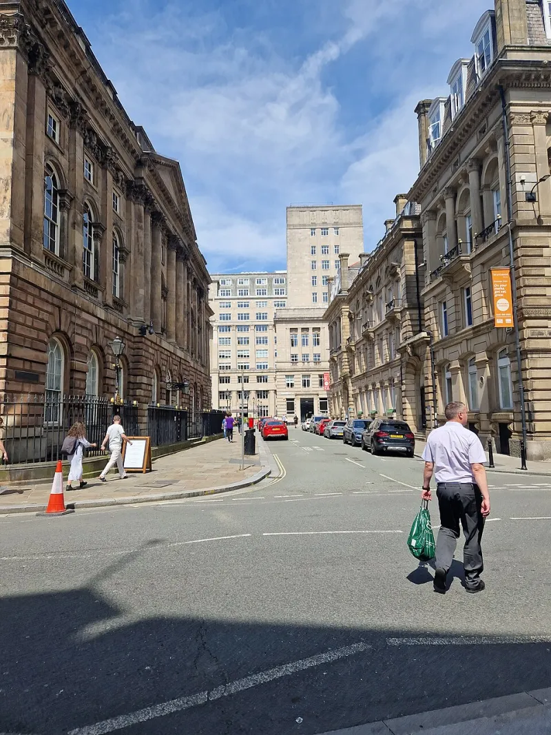
Photo: Frombowen, CC BY-SA 4.0, via Wikimedia Commons
On Tuesday afternoon I left the studio at twenty past four with a print folder under one arm and a tablet under the other. By half past, the streetlamps were on, the sky had gone that thin blue-grey colour, and the chip shop window was doing more for the pavement than the actual sun had managed all day. I had meant to post a couple of prints, but I ended up standing outside a café like someone waiting for a friend, holding my own work at arm's length and squinting at it.
That is the whole idea behind what I have started calling the 4:30 Lamplight Test. Not a scientific colour-management ritual. More a small, repeatable habit: take your portfolio out into the ordinary light of a UK winter dusk and see what other people actually see. No gallery spotlights. No tidy desk lamp. Just the high street doing its messy, mixed-temperature thing.
Why the early dusk is a free proofing booth
Winter dusk in the UK is not one light. It is a stack of them. There is the cool blue leftovers of the sky, the warm yellow spill from café windows, the cold white glare of bus-stop LEDs, and the orange wash from older streetlamps that makes everything look vaguely like a photograph left in a drawer since 1987. Your work will be judged in that mixture, whether you plan for it or not.
If your portfolio only ever gets seen under studio daylight or a carefully calibrated monitor, you are rehearsing in a clean room and then performing in a pub. The dusk walk is free, local and surprisingly honest. It also gets you out of the house, which in November is half the battle.
A slow lap of the high street
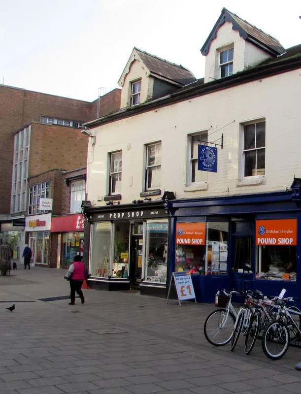
My route is not glamorous. I walk to the end of the road, stop by the café with the big window, cross to the bus shelter, stand under the first streetlamp that comes on, and finish outside the closed charity shop where a bright white security light makes everything look slightly accused. It takes about twenty-five minutes if I do not get distracted by the bakery.
At each stop I hold up one print or open one screen at normal viewing distance. I do not adjust anything. I just look for three seconds and note what happens. What reads first? What disappears? Does the paper go creamy, grey or slightly green? Is there a glare patch where a shadow should be? The point is not to fix everything on the spot. The point is to collect evidence.
Café windows, bus stops and the orange wash
Warm café windows are flattering to creams, skin tones and anything with a bit of red in it. They can also turn cool greys into something muddy and make a careful neutral look like it has been dipped in tea. Bus-stop LEDs are the opposite: brutally clean, slightly blue, and very good at showing up fingerprints, glossy paper and the faint grid of a tablet screen. Under those lights, contrast either holds up or it does not.
The orange streetlamp is the real tester. Deep blues can collapse into black. Reds can go brown. A subtle mid-tone separation that looked elegant on my desk can turn into one flat shape. This matters if you are showing work at an evening market, a pub back room or a client meeting that runs past four o'clock. If a key detail only survives in studio light, it is not robust yet.
The dusk-walk checklist
This is the version I keep in my notebook. It is deliberately short, because a long checklist in November just becomes another thing to avoid.
- Pack one hero print, one detail-heavy print and one dark print. Add your phone or tablet if that is part of your presentation.
- Head out twenty to thirty minutes before the lamps come on, and stay out until after they have settled. The change is the useful bit.
- At each light, ask: what do I see first? Does the title or name read? Are the shadows blocked up? Is there glare? Has the paper colour shifted?
- Look at arm's length, then step back two metres. Portfolios are often viewed at the wrong distance, especially on a market stall.
- Test screens at around half brightness as well as full. Auto-brightness can be helpful, but it can also hide a weak image.
- Check prints in and out of their sleeves. A glossy sleeve can add a reflection you never see on the desk.
- Take a quick phone photo of each setup as a note. It is not for Instagram; it is so you remember which lamp made which mess.
- Write down three fixes maximum. Any more and you will spend December rebuilding the whole portfolio instead of showing it.
What I changed this week
My own dusk audit produced a modest list. I moved two prints from glossy to matte paper, because the bus-stop light was turning them into mirrors. I lifted the contrast slightly on a dark night photograph that had been tuned for my monitor and was turning into a puddle under the streetlamp. I also swapped one portfolio sleeve for an anti-glare version, which felt deeply unglamorous and made a genuine difference.
The biggest change was to my tablet setup. I had been showing images at full brightness, which looked punchy indoors and slightly desperate at the bus stop. Locking it nearer the middle made the work feel calmer and more consistent. I also added one warm-toned image and one cool-toned image next to each other, because dusk makes colour temperature shifts obvious and I would rather see them before a client does.
Before your next outing
You do not need a whole evening. Twenty minutes in the week before a client meeting or a winter market is enough to catch the obvious problems. Take a friend if you can, and ask them what they notice first. Their answer is usually more useful than another hour of tweaking.
And try not to overcorrect. The aim is not to make your work look good under one orange lamp at the expense of everywhere else. The aim is to make it hold together in the mixed, imperfect light where real people meet it. November is short on daylight, but it is generous with testing opportunities. The 4:30 Lamplight Test has become one of my favourite studio habits: a small walk, a notebook, and a honest look at what the street makes of the work.