The Dame Knows Best: Five Panto Habits That Keep a Portfolio Viewer With You
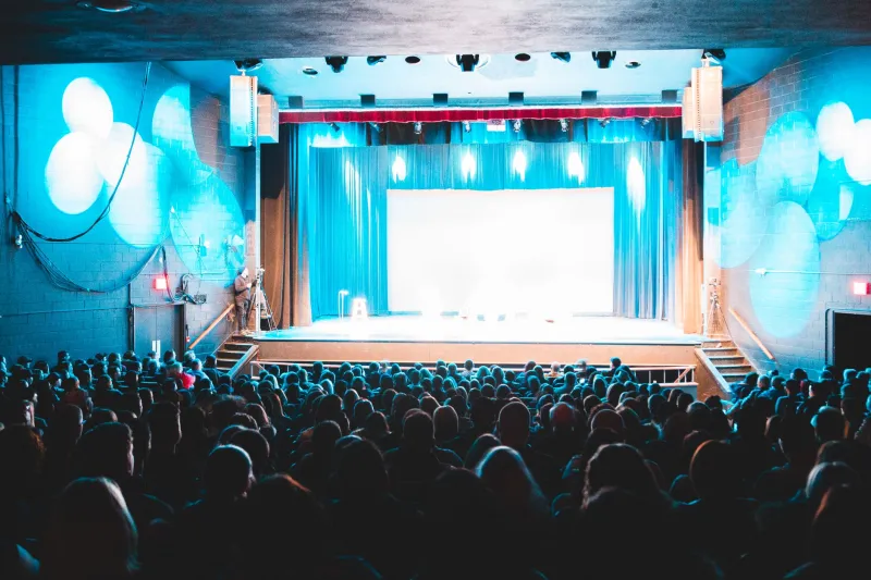
The village hall panto I watched last winter had a fairy lit by what looked like a bicycle lamp, a cardboard forest that wobbled whenever anyone brushed past it, and a child behind me who had brought an entire bag of crisps and no intention of sitting still. By the interval, that child was shouting at the stage with the rest of us. No one had checked their phone. The cast was made up of volunteers, the script had more holes than the tea urn, and it was one of the most attentive rooms I have sat in all year.
I have been thinking about that evening ever since I started rebuilding one of my own project pages. A portfolio page has a lot in common with a panto audience: people arrive distracted, they have no obligation to stay, and they will absolutely wander off if you make them work too hard for the good bit. The difference is that the panto knows this and plans for it. Most portfolio pages act as if the viewer has all the goodwill in the world.
So here are five things the volunteers taught me, and what they looked like when I applied them to a real page rather than just nodding along.
1. Signpost the next bit before you need it
Panto is ruthless about signposting. The dame tells you who she is, the narrator explains what is about to happen, and the song sheet tells you when to join in. Nobody is left guessing for long. It is not subtle, but it is kind.
My project page was the opposite. It opened with a moody full-bleed photograph, a tiny caption, and no clue what I was meant to be looking at. I had thought it was atmospheric. In reality it was a locked door with a nice paint job.
Before: image, image, paragraph beginning ‘This project emerged from a period of…’, then a grid of twelve photographs.
After: a single line at the top — what it was, who it was for, what I did — then the same moody photograph. The image had not changed. The viewer now knew why they were looking at it. I also added a small ‘what happened next’ link at the bottom of the first section, so anyone who wanted to skip ahead could do so without hunting.
Signposting is not dumbing down. It is basic hosting. Tell people where they are, what they are about to see and how long it will take. They will relax into the page instead of bracing against it.
2. Ask the room a question, even a small one
Call-and-response is the engine of panto. ‘Oh no it isn’t’ is not a sophisticated joke, but it gives the audience a job. The moment they have a job, they are in the room rather than watching the room.
A website cannot hear you shout back, but it can still ask you to think. On my rebuilt page I replaced a passive section heading called ‘Process’ with a question: ‘What would you have done with this awkward corner?’ Underneath, I showed two options I had tried and why one failed. The section was still about my process, but it invited the viewer to compare rather than simply receive.
I did the same with captions. Instead of ‘Final installation view’, I wrote ‘The bit I nearly cut’. Instead of ‘Detail’, I wrote ‘Look at the join here’. Tiny changes, but they turn a wall of images into a series of small invitations. The viewer starts nodding along rather than scrolling past.
3. Repeat the important bit, just not word for word
The panto repeated everything. The villain’s plan was stated in scene one, hinted at in scene two and yelled about in scene three. By the finale, even the crisp-eating child could tell you what was at stake. Repetition was not laziness; it was structure.
Portfolio pages often say the important thing once, in the middle, in a paragraph that is easy to miss. I had done exactly that. My key idea — that the project was about making a temporary space feel permanent — appeared in paragraph four and then vanished.
Before: one mention of the idea, buried in the middle, followed by lots of pictures of walls.
After: the idea appeared in the opening line, in one caption where it made sense, and in the closing paragraph in different words. I did not copy and paste the same sentence. I let it echo. The page felt more coherent and, crucially, I could tell people what it was about without reading from my own notes.
4. Put the pause before the payoff
There is a reason panto actors hold a beat before the punchline. The pause gives the audience time to lean in. It is not empty time; it is working time.
On a scrolling page, the equivalent is not making the viewer wait through a needless animation. It is giving the payoff room. My original page threw every image at the same size, one after another, so the best photograph arrived with no more weight than the fifth-best.
Before: twelve equal images in a grid, best one somewhere near the bottom.
After: a short paragraph of context, a small supporting image, then the main photograph full width. The pause was a few seconds of reading and a smaller image. The payoff landed because it had something to land against. I also moved the strongest detail shot to just after the full-width image, like a second laugh after the big line.
5. Let the homemade bits do some work
The bicycle-lamp fairy got the biggest cheer of the night. The cardboard forest was more memorable than any rented backdrop could have been. Cheap does not mean careless; it means human. The audience could see the effort and the join, and that made it easier to trust.
My project page had been over-polished. Every image was retouched, every mock-up was pristine, and the whole thing felt like a showroom rather than a studio. So I added a scanned page from my notebook with coffee rings and crossings-out. I included a phone photograph of the space before I started, slightly blurry and much more useful than the polished version. I left in a small, hand-drawn diagram of how the lighting was rigged.
None of it was slick. All of it explained something. The page became easier to read because the homemade bits gave the eye a rest from the perfect ones. They also made the project feel like it had been made by a person, which is the whole point of a personal site.
The page after the panto
Rebuilding that page took an afternoon. I did not add more work; I moved what was already there. The opening line now does the job of the narrator. The captions ask small questions. The main idea repeats in different clothes. The best image gets a pause before it appears. And the notebook scan sits near the end, doing the work of a wobbling cardboard tree.
The page is not perfect. It still has a few too many images and one paragraph I am not entirely happy with. But it holds attention better than it did, and that is the job. A viewer with no goodwill to spare will not stay for a clever concept. They will stay if they know where they are, if they are given something to do, and if the good bit arrives with a bit of room around it.
He is behind you, after all. You may as well make sure your viewer is still looking.