A-Side Manners: Sequencing a Portfolio for the Impatient Browser

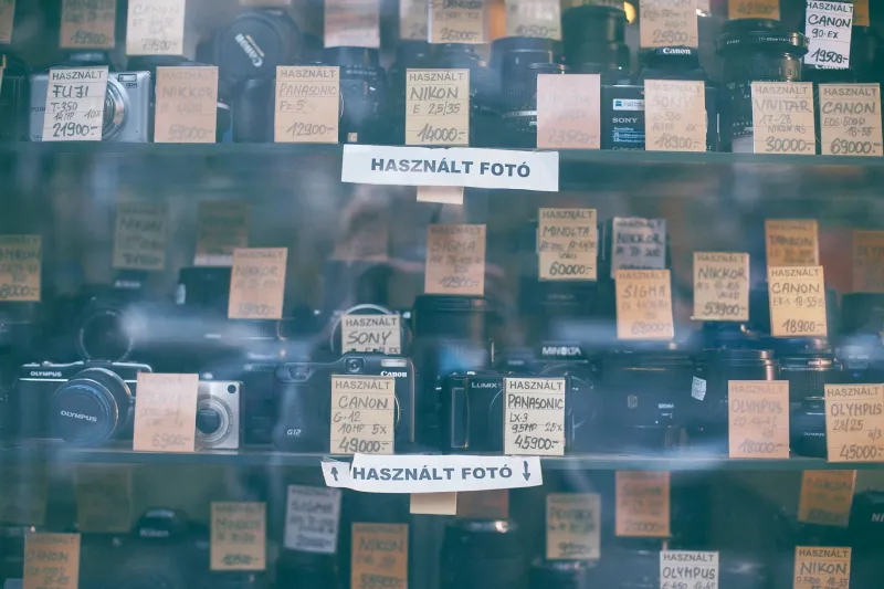
There’s a record shop in town that still has a listening post: one battered pair of headphones, a laminated card of track listings, and a little sign saying “Five minutes, please — someone else is waiting.” I love it. It’s not precious. It’s a shop, not a shrine. You get a short go, you hear enough to decide, and then you either buy the record or put it back.
I’ve been thinking about that sign ever since. Most portfolios get exactly the same treatment. A visitor lands on your homepage in a bus queue, thumb hovering, five minutes at best. They are not being rude. They are behaving like normal people in a shop. So the question isn’t “how do I make them stay for an hour?” It’s “what can I honestly give them in five minutes?”
The five-minute sitting
Try this as an exercise: open your portfolio on your phone, set a timer for five minutes, and browse it as if you’ve never seen it before. No scrolling back to check things. No pausing to admire your own cleverness. Just go.
What happens? Usually one of three things. Either you see too much of the same thing, or you can’t work out what you’re meant to look at first, or you run out of things to look at before the timer goes. All three are useful notes.
A good listening post doesn’t play the whole album. It gives you a taste that makes you want the whole thing. Your portfolio can do the same. The first screen should tell a stranger three things quickly: what kind of work this is, whose work it is, and why they might care. Not in a corporate strapline. In plain words, the sort of thing you’d say if someone asked you at a kitchen party.
I’ve started treating the first few projects as the A-side. They need to be strong, but they also need to be friendly. A big flashy opener is all very well, but if it’s followed by three variations on the same flashy opening, the visitor’s hand drifts to the rack. Better to open with one clear statement, follow it with something that shows your range, and then let a quieter piece do some breathing.
A-sides and B-sides
The A-side isn’t “the best work”. It’s the work that makes the best introduction. That might be a small, tidy project that shows how you think, rather than the biggest, loudest thing you’ve ever made. I’ve seen portfolios where the opening piece is so enormous that everything after it feels like the B-side by default. That’s not sequencing; that’s a landslide.
Think of the B-side as the place for depth. This is where you can put the slower, more involved pieces: the project with a longer story, the collaboration, the experiment that didn’t quite work but taught you something. B-sides are not lesser. They’re for the listener who has already decided they like the sound of you and wants to know more. The trick is to make sure the A-side has done its job before they get there.
A simple sequence I keep coming back to: opener, range, breather, proof, oddity, close. Opener says hello. Range says you’re not a one-trick pony. Breather gives the eye a rest. Proof shows the craft up close. Oddity keeps it human. Close leaves a tidy edge, like the last track fading out rather than stopping mid-sentence.
Liner notes, not lectures
Record shop track cards are brilliant because they give you just enough. Artist, title, maybe a line about the sound. They don’t write a dissertation on the bass player’s childhood. Your captions can learn from that.
A good project caption should answer the quick questions: what is it, who was it for, what did you do, and what’s one detail worth noticing? That’s it. If you can do that in two or three sentences, you’ve written a liner note. If it takes six paragraphs before you mention the client, you’ve written a lecture.
I’m not saying never write long. I’m saying earn the long version. Have a short caption that rewards a quick browse, and then — if the project deserves it — a longer case study behind a link. That’s the difference between the track card and the sleeve notes. Both are useful. They just do different jobs.
One small rule I’ve adopted: every caption should contain one concrete detail that a visitor couldn’t guess from the image. A material, a constraint, a daft bit of luck. “We shot it on a rainy Tuesday because the client’s dog was being filmed that morning” is better than “a dynamic visual identity”. It gives the browsing eye something to hold onto.
Which pieces get the full-album listen?
Some work needs time. A process-heavy project, a long-form collaboration, a piece where the thinking matters as much as the final image — those are full-album listens. They don’t belong in the five-minute dash unless you give them a very good extract.
A useful test: cover the caption. Can a stranger understand why this piece matters from the image alone? If yes, it can live on the A-side. If no, it might still be excellent, but it needs context. That means either a longer entry, a process page, or a place further back in the sequence where someone has already decided to trust you.
Another test: does it need a skip? If you find yourself scrolling past a piece every time you review your own portfolio, that’s a note. Either it’s in the wrong place, or it needs a better caption, or it’s honestly not doing the job anymore. Putting it on the B-side isn’t a punishment. It’s just good shopkeeping.
The shop-floor rule
The listening post works because it respects the browser. It doesn’t lock the door and demand an hour. It says: here’s five minutes, have a listen, see what you think. Your portfolio can offer the same courtesy. Make the first few minutes clear and generous. Write captions that sound like a person. Keep the deeper work available for the people who want to lean in.
And if you’re ever unsure, imagine the battered headphones and the little sign. Five minutes, please. Someone else is waiting. What would you play them?