Clutter With a Job to Do: Seven Editing Cues from a High Street Window
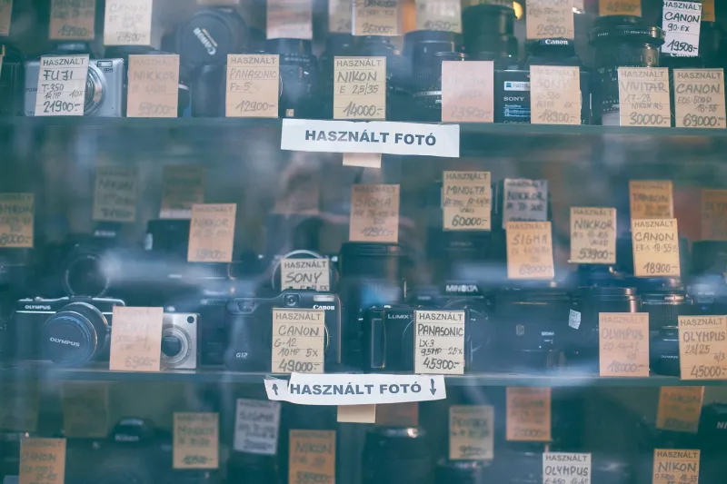
Last Tuesday I stood outside a corner shop in the rain, waiting for a bus that never came. The window was no bigger than a front door and absolutely packed: tins, birthday cards, phone chargers, a handwritten card reading 'Batteries 2 for £3'. By rights it should have been visual noise. Instead, my eye moved through it in a clear order. I got out my notebook and sketched the whole thing badly, then stood there a bit longer. This is not a plea to make your portfolio look like a shop. It is a note on how a busy window can still behave like an edited one.
1. Give the eye one anchor
The window had one bright anchor: a tower of orange squash bottles, centre-left, catching the grey light. Everything else supported it. The birthday cards sat to the right, the batteries below, the phone chargers on a hanging strip near the edge. In portfolio terms, that is one hero piece per view, per project page, per screen. If three pieces are all shouting, none of them is heard. Pick the anchor first, then let the rest form a chorus.
2. Repeat a shape, not a colour
What made the window feel ordered was not a restricted palette. It was repetition of shape. Rectangles everywhere: price cards, cereal boxes, SIM packs, till receipts taped to the glass. The repetition gave the eye a rhythm to follow. Your portfolio can do the same without becoming boring. Repeat a crop ratio. Repeat a caption position. Repeat the size of your thumbnails. A messy middle still needs a beat.
3. Handwritten cards are captions, not decoration
The blue biro card saying 'Open Sundays' was not beautiful. It was useful. That is the standard for portfolio captions too. A good caption does a job: title, year, medium, and one line of context. Do not make the viewer guess what they are looking at. The handwritten aesthetic is optional. Clarity is not.
4. Scarcity is a material
Even a packed window used scarcity. There were only two birthday cards visible in one section. There was a deliberate gap at the bottom where the sill met the glass. That gap framed the goods above it. In a portfolio, scarcity signals value. Fewer pieces per page. One project per spread. White space around a cover image. If everything is shown, nothing is chosen.
5. Build shelves in the layout
The shop had step shelves, a hanging strip, and the window ledge. Three levels, three speeds. My eye travelled top-left to bottom-right without being told. Portfolios need invisible shelves too: a grid, a baseline, consistent margins. Even expressive work needs an armature. Sketch the layout on paper before you open the software. It is faster to move a rectangle with a pencil.
6. Let one colour do the pointing
A single red 'SALE' card pulled my eye across the glass. The rest of the window was muted by comparison. One accent colour can guide a viewer through a portfolio in the same way: section tabs, caption rules, project numbers. Use one accent, not five. In print, that might be a spot colour. On a website, it might be the link colour and nothing else.
7. Rotate, but keep the frame
The shop changes its window every week or so. The frame stays: the shelves, the hanging strip, the handwritten cards. That is a useful model for a creative site. Update the work seasonally. Keep the navigation and presentation consistent. New projects feel fresh, but the viewer is not relearning the layout every time. In my own studio diary, I rotate the prints on my wall every six weeks. The wall stays the same.
The one-window test
Before you publish, imagine your entire portfolio as one shop window. Or one screen. Then try this:
- Screenshot your homepage or contact sheet.
- Squint at it until the details blur.
- Ask: what is the anchor?
- Count the competing focal points. If there are more than two, edit.
- Read the captions without any other context. Do they still work?
- Remove one thing. Then check whether the gap helps.
If your eye knows where to start and where to go next, you have passed. If not, you have some editing to do. None of this is about minimalism for its own sake. The corner shop is not precious. It is practical. It wants you to find the milk and maybe buy a card on the way out. A portfolio can be practical too.
I left with batteries I did not need and a page of notes. The window was not designed by a gallery. It was designed by someone who wanted the display to work. That is editing.