Don’t Sand the Edges Off: A High Street Sketchbook Plea
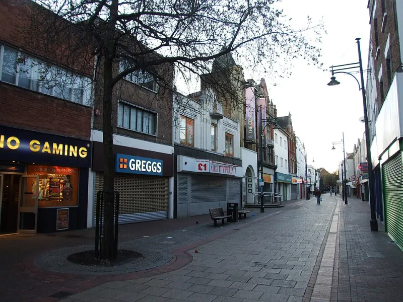
Photo: Chris Whippet , CC BY-SA 2.0, via Wikimedia Commons
An open letter, posted from the pavement
Dear town centre,
I know you are under pressure. Empty units, rising rents, the slow drift of shopping online, the council leaflet that uses the word 'regeneration' four times before breakfast. I am not here to tell you that decline is charming. It is not. A boarded-up shop is not a mood board, and a broken kerb is not a design feature.
But please, while you are being repaired and repainted and generally asked to smarten up, do not sand the edges off. The wonky bits are not just nostalgia. They are creative material, and once they are gone, they are remarkably hard to invent again.
What I saw on a Tuesday wander
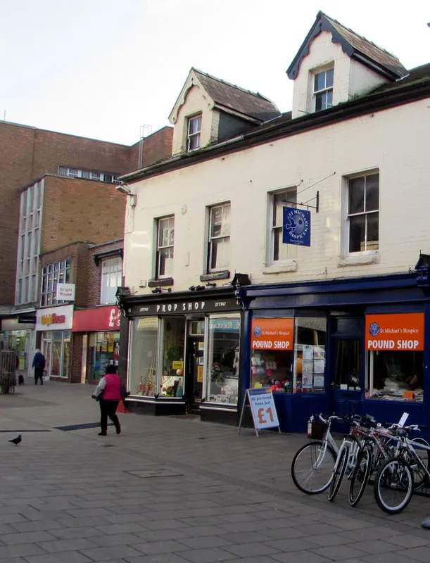
I went out with no agenda except a coffee and a notebook. The first thing I noticed was the chip shop with turquoise trim next to a card shop the colour of a mint imperial. Neither colour would have occurred to me on a screen, but together they had a strange, cheerful stubbornness. A few doors down, a hand-painted sign for a key cutter had been touched up so many times that the letters looked slightly out of breath.
In the indoor market, a stallholder was rearranging a table of striped awnings and plastic bowls. The stripes were faded in patches where the sun had reached them. Outside, a ghost sign for a former grocer was still legible if you tilted your head, and a bench had been repainted so often that the layers looked like tree rings. A bus shelter advert was peeling at one corner in a way that made a very good shape.
None of this was picturesque in the calendar sense. It was just specific. That is the bit I want to keep.
Character is not the same as neglect
I want to be careful here. Noticing the beauty of a faded sign is not the same as asking for places to be left to fall apart. A town centre can keep its character and still get the roof fixed. It can replace the bins without replacing the whole personality of the street. The argument is not 'leave everything alone'. The argument is 'do not confuse tidying with improving'.
There is a real difference between patina and disrepair. Patina is the evidence of use: worn steps, layered paint, a sign that has been repainted by three different hands. Disrepair is a hazard: loose paving, broken lights, doors that do not open. One is material. The other is neglect. A good high street needs less of the second and more respect for the first.
Why this belongs in a portfolio
A portfolio is not just a record of things you have made. It is evidence of how you see. Town-centre details are excellent training for that. They teach you composition before you have a camera in your hand: the way a striped awning cuts across a brick wall, the way a queue outside a bakery makes a diagonal, the way a badly placed 'To Let' sign creates an accidental collage.
They teach typography too. Hand-painted lettering, old shop names, the ghost of a previous business underneath a new one — all of it is a lesson in hierarchy, spacing and the dignity of a slightly wonky O. And they teach colour in the wild, where things clash because they have to share a pavement, not because someone curated them.
The trick is not to turn the town into a aesthetic. The trick is to take one specific detail and let it become a project. A colour palette from three shopfronts. A type study from market signs. A backdrop inspired by a striped awning. A prop story built around a bench with too many layers of paint.
A sketchbook exercise: fifteen minutes, one street
Pick a stretch of high street you can walk in fifteen minutes. Do three passes.
On the first pass, collect five details you would normally walk past. Not whole buildings. Details: a door handle, a faded sign, a strip of tiles, a hand-written price card, the join between two shopfronts.
On the second pass, match three colours. Use paint chips, pencil swatches or notes in the margin. Do not photograph everything. Force yourself to describe the colour in words: 'mustard with a bit of grey in it', 'the green of a public swimming pool in 1987'. The words will be more useful later than another camera roll full of shopfronts.
On the third pass, choose one detail and redraw it as something else. A sign becomes a poster. A tile pattern becomes a background. A peeling advert becomes a texture. Do not make it neat. Make it useful. Write one sentence underneath about what you would actually use it for: a portfolio cover, a print, a set of three postcards, a backdrop for a small shoot.
What to leave in the sketchbook
Not everything needs to be posted. Some of this work is just for you, and that is fine. Be respectful when you photograph: no close-ups of people without asking, no blocking a shop doorway, no treating a working market stall like a film set. The point is to notice, not to extract.
And keep the notes. Weather, time of day, the song coming out of the barber's, the fact that the bakery smells like hot pastry and the charity shop smells like raincoats. Those details are what stop the work from becoming a generic 'high street' mood. They make it yours.
Please don’t sand the edges off
So here is my plea, town centre. Fix what is broken. Make the pavements safe. Fill the empty units with something useful. But leave a few of the odd bits alone. Keep the wonky sign. Keep the turquoise trim. Keep the bench with too many layers of paint. They are not holding you back. They are giving someone a reason to stop, look and make something.