The Reservation Trolley Principle: Ordering a Portfolio Like a Library Queue
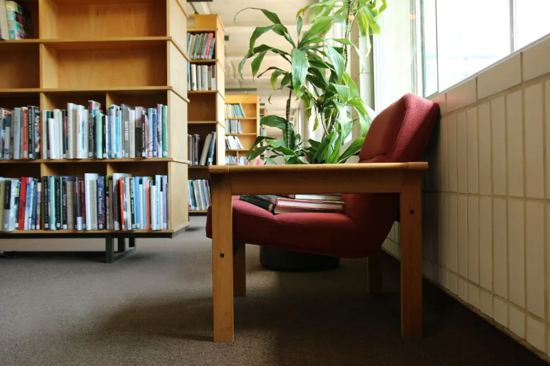
I went into town on a wet Tuesday to collect a book I’d reserved weeks ago. Nothing glamorous about it. The library was warm, the carpet was doing its usual thing, and behind the counter was the reservations trolley: a neat little queue of books with paper slips tucked into their covers. I stood there waiting while someone found my copy, and I had one of those small, annoying thoughts that turn into a studio note. My portfolio should behave more like that trolley.
Not a stack. A queue. A sequence of things arriving in the right order for the right person.
The shelf is not a stack; it’s a sequence
A reservations shelf is brilliant because it makes a promise. Every book on it has been asked for. Someone has said, in effect, I want this next. The library hasn’t dumped every title it owns onto the counter and hoped for the best. It has narrowed the choice to a short line of waiting items, each with a name attached.
Portfolios often do the opposite. We pile everything on the homepage and call it a body of work. Then we wonder why viewers drift. The library model is kinder. It says: here is the thing you came for, here is the thing beside it, and here is a hint that something else is on its way. That is a much better welcome than a random heap of good intentions.
Cue one: put the obvious request at the front
When you reserve a book, you usually know what you want. A novel by a particular author. A local history title. A manual for repairing something you’ve broken. The reservation shelf respects that. The requested item sits ready, not buried under twelve things you didn’t ask for.
Your portfolio needs the same courtesy. The first piece should answer the question a viewer arrived with, even if that question is only what does this person actually make? Lead with the clearest, most complete piece you have. Not necessarily the flashiest. Not the one with the most tortured artist statement. The one that does the job with the least faffing about.
In my own studio diary, I’ve started asking a blunt question before I reorder anything: if someone has thirty seconds, which piece tells them what I do and why it might matter? That piece goes near the front. The experimental stuff can follow once they’ve got their bearings. A library doesn’t open with the reserve stockroom and neither should you.
Cue two: keep one item visibly on hold
One of the nicest things about the reservations trolley is the sense of continuation. There are books ready today, books in transit, books on order. The queue is visible without being noisy. You can see that more is coming.
A portfolio can borrow that feeling without turning into a teaser campaign. You don’t need countdown timers or mysterious silhouettes. You just need to leave a clear next step. A small line at the end of a project saying there are more from this series. A second image that hints at a wider shoot. A short note that a new set of prints is being prepared for the winter. Something honest, specific and low-key.
The key is not to make the viewer feel they’ve reached the end of a dead-end shelf. Leave one item on the trolley. Let them see the slip. Then let them decide whether to wait for it.
Cue three: return the trolley
Libraries reshelve. They move stock, renew reservations, take things off display and put other things forward. It looks like housekeeping, but it’s really curation. The shelf stays useful because someone keeps tending it.
Portfolios need the same monthly sort-out. I’ve started setting aside ten minutes at the end of the month to look at the top of my site the way a stranger would. What’s ready? What’s lingering? What’s still on display only because I couldn’t be bothered to move it? Old work doesn’t have to be deleted. It can go back into the archive, the way a library moves a book from the reservations trolley to the main shelves. The homepage is not a storage unit. It’s a service desk.
That tiny habit has made my portfolio feel less like a portfolio and more like a place that’s actually open. There’s a front line of work that’s ready to go, a small queue behind it, and a bit of breathing room in between.
What changed in the studio
Since that wet Tuesday, I’ve made three small changes. I moved my clearest project to the front page. I added a single line at the end of it pointing to a related set of photographs. And I started a scruffy note on my desk headed Holds, where I put pieces that aren’t quite ready but shouldn’t be forgotten.
None of it is dramatic. That’s the point. A library reservation queue isn’t dramatic either. It’s just a quiet, useful sequence of small arrivals. Your portfolio can be the same: ordered, welcoming, and honest about what’s next. Next time you’re in town, have a look at the reservations trolley. Then have a look at your homepage. The difference might surprise you.